Action shot of Kelly drawing during an in-person presentation.
Reflections on a past presentation
December 2021
December 2021
It was May 2020, and I had just presented at the interaction design craft meeting on Storytelling and Synthesis.
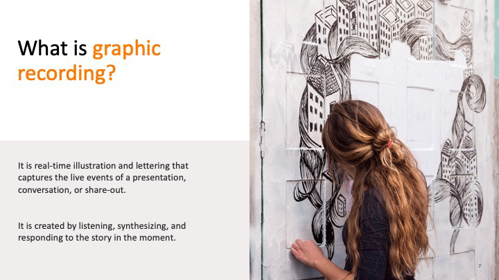
I had been doing a lot of graphic recording and visual facilitation at the time. Graphic recording is physically active, mentally draining, and downright fun in a way that UX work is... not always. There is a flow during a workshop when you are listening so closely to what the presenter is saying and at the same time taking in the audience's reactions, and at the same time jotting down keywords, and at the same time switching markers from writing back to drawing. The adrenaline rush is addicting.
But it was strange, to hold the title of interaction designer and not be hands-on-keyboard wireframing. I was thinking a lot about how the two types of work intersected, and how I could share that with the rest of the studio. Surely there was some transfer in the craft I had spent the past three years practicing, something unrelated to my ability to doodle on walls really fast?
. . .
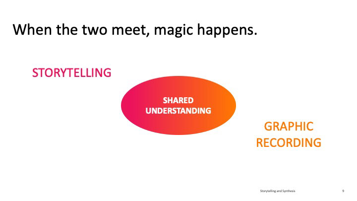
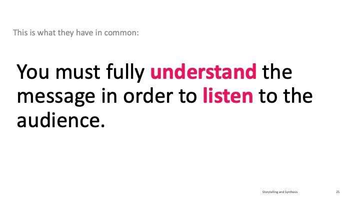
My hypothesis is that it is the ability to listen to and synthesize multiple layers of meaning that both these crafts have in common.
From a UX perspective, the skill comes into play through user research. It is important to observe and take notes from multiple angles: what a user does, what they say out loud, but also the intonations, or body language, or hesitation to click.
It is a difficult task I have always seen as a struggle in usability test note-taking. It's why I find it so valuable to have video recordings in order to watch a usability test multiple times, or else have multiple team members taking notes with different "hats" on at the same time. After the hard work of documenting the data is done, there comes again the mass of confusion, when the researcher sifts through a morass of untagged data and strives to organize it.
Graphic recording requires the recorder to take down what is important in real time. Since the human experience of time is linear, this means they have to pay attention to multiple channels of meaning simultaneously. Besides the usual, straightforward "what did they say in what order," there are also subtler cues.
- Who is speaking? What group are they a part of? What are the intergroup dynamics of the participants?
- Is this statement referring to the past, present, or future?
- Have the last several points been in agreement, opposition, or going in a new direction?
- How does the mood of the room change in response?
- Is this statement referring to the past, present, or future?
- Have the last several points been in agreement, opposition, or going in a new direction?
- How does the mood of the room change in response?
There is no ability to go back and rewatch. All this information is coming in at the same time, and again in real time, the recorder needs to select and document the most important information. The narrative she chooses to emphasize is expressed through words and icons, quotes and illustrations, all of which fly across the page, filling the white space as the day goes on.
In that sense, sensemaking in UX research is easier. We have the luxury of being able to take out time to sift through the data from multiple linear narratives and fit the puzzle pieces into the framework at our leisure. They say that in Eastern art, the artist practices a thousand times for a painting of a single brushstroke, whereas in the Western style the artist uses a thousand brushstrokes for a single painting.
The challenge in both cases comes in putting all those details together in a way that the casual observer is able to grasp the larger concept at once. That's where frameworks come in.
Frameworks, whether diagrams or narratives, help us make sense of an overwhelming amount of information by putting it into a form we find familiar. Narrative frameworks help us structure and communicate information linearly, just as visual frameworks help us organize levels of detail into a clear hierarchy at a glance.
Once the data has been combed, brushed, and smoothed into a journey, ecosystem, or interface, it has a nested hierarchy of zoomed-out and zoomed-in sensemaking that allows the viewer to pay attention to the extent that they choose. It gives them a feeling of agency over the information. After all, according to self-determination theory, autonomy is one of the basic human psychological needs!
But creating that simplicity takes effort. It takes conscious filtering of the initial barrage of information, and selection of the right tool to express that meaning, and placement of each stroke of meaning into a framework that organizes it all.
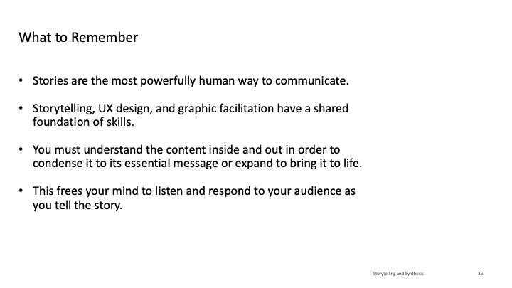
To me, there is something magical, almost supernatural, in being able to see the same message through multiple layers at once. I think the key skill is being able to float in between those dimensions, to exist in multiple planes of meaning at the same time and draw from each one at the appropriate time.
The UX designer or graphic recorder bears the burden of messy reality so the end user has the luxury of a well-crafted story.
Sample Slides
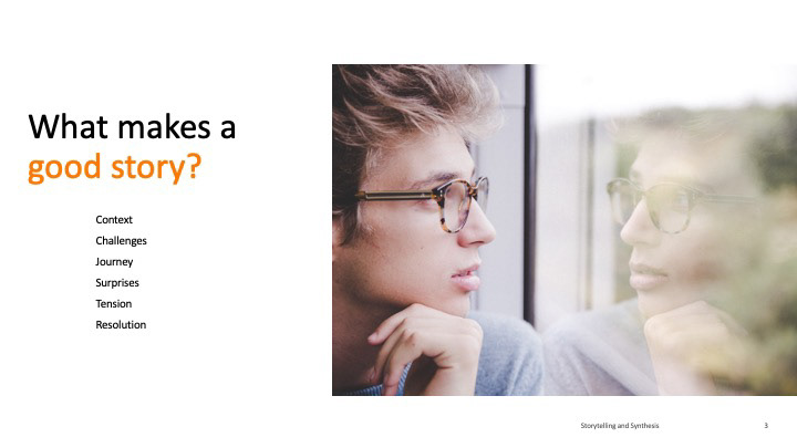
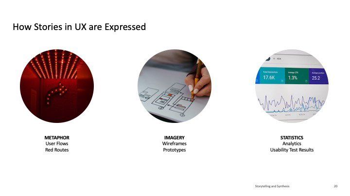
I have included an abbreviated version of my presentation below to give as sense of the storyline.
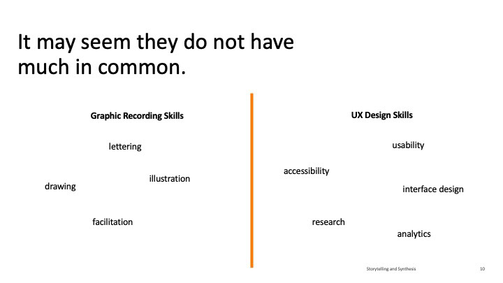
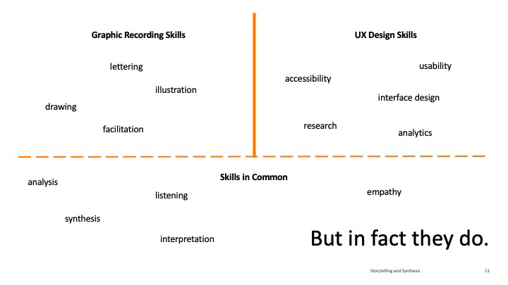
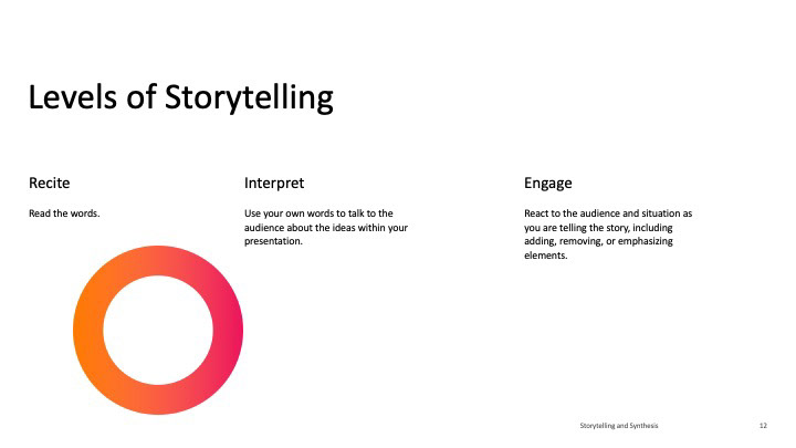
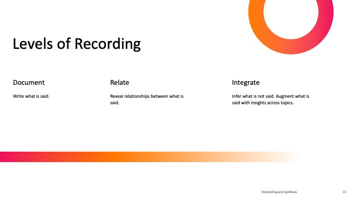
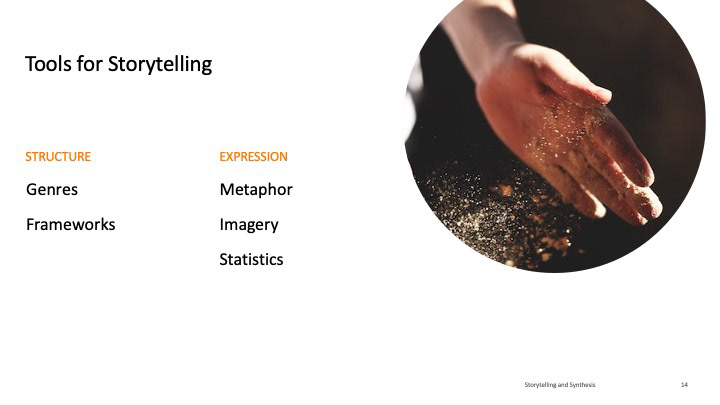
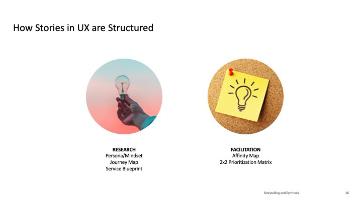
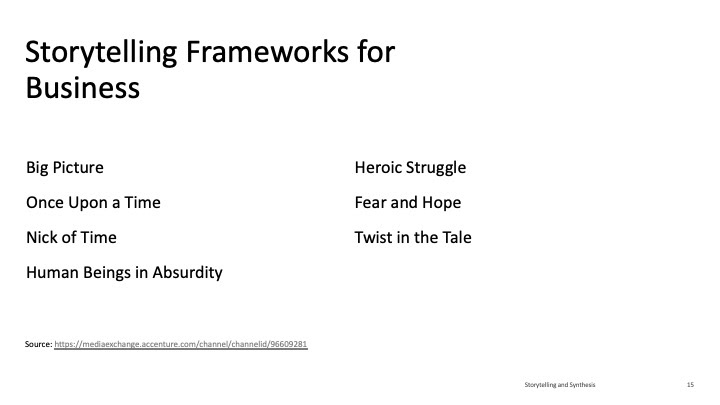
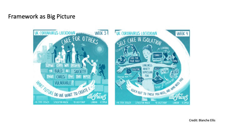
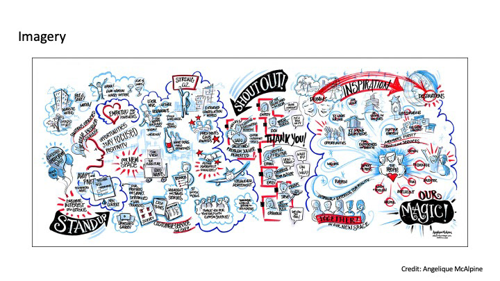
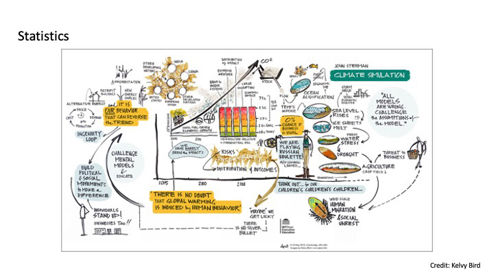
Note: the original version of this presentation included samples of my own work in graphic recording. This abbreviated presentation relies on a small number of other artists' publicly published graphic recordings as placeholders to illustrate a framework, replacing my own humble efforts. All credit goes to them for their work.


